
Correlation & the Efficient Frontier

Today I want to discuss correlation within the context of portfolio construction.
If you live in a climate where the weather is unpredictable, you will want a furnace as well as an air conditioner. You will need a wardrobe that takes into consideration the varying weather.
The same could be said about portfolio construction.
Covariance, Correlation, & Diversification
Correlation and covariance measure the degree to which different investments are likely to behave relative to one another during different economic environments. The goal is to achieve diversification by combining investments that are somewhat uncorrelated so that if one investment does not perform well, there will be other investments in the portfolio that will.
Perfect Inverse Correlation
As a concept, consider a two stock portfolio where when one stock increases in value as the other declines by exactly the same value.
Clearly this is no good if we wish to grow wealth.
Still, we wish to build a portfolio that does zig and zag in a stable way – Increasing in value while minimizing risk.
Risk
Even if assets are individually volatile, low or negative historical correlation can make the experience of owning them together smoother. This is very beneficial to most investors because it can make it easier to stay on track and accomplish financial goals without enduring large swings in the value of their savings.
The correlation of a portfolio determines whether the combination of its holdings has reduced or concentrated market risk.
Maths & The Efficient Frontier
A correlation of 1 implies that all assets should move in lockstep. Anything below 1 mathematically begins to offer the benefits of diversification to a portfolio. The model below will assume that all portfolios will eventually perform the same but the most efficient will do so with less volatility. The yellow line is the Efficient Frontier achieved by low correlation. Out of these three frontier lines, the yellow line represents the lowest risk for identical expected returns.
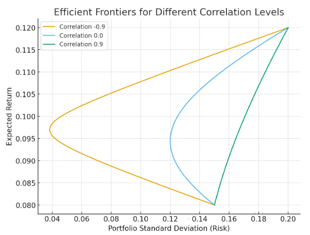
Look at the middle of this graph where the yellow line is most extended to the left. It achieves a 10% expected return in exchange for taking on a standard deviation (risk) of 4.5% while the green also earns 10% but accepts a 17% level of risk.
As a concept, you will see that the yellow line represents the least correlated portfolio at -0.9. The green line can achieve the same results with a correlation of 0.9, however, gets there with more volatility.
Portfolio risk is described by the x axis – Standard deviation. The higher the number, the more volatility. In this model, all portfolios can eventually achieve a 12% expected return as measured by the y axis. The yellow line, however, arrives at this outcome with considerably less volatility as a result of diversification. If you follow the horizontal lines, you can see that the less efficient portfolios will generate identical returns with more volatility.
As demonstrated by this graph, we see that as we move to the riskiest upper right hand corner all results converge. But if you owned the green portfolio, do you think you would have had the backbone to make it to the upper right? Why not manage risk and get there flying first class?
In reality, the efficient frontier is mainly an academic concept. Still, it is a good way of considering how important it is to be diversified and try to create a portfolio that has low correlation.
If you would like to discuss different ways to approach wealth creation, call the office.
-Zac